Covers for Origin East Africa, edited by David Cook (AWS 15, 1965), and Houseboy, by Ferdinand Oyono (AWS 29, 1966).
It wasn’t long ago that pocket-sized orange books, slightly larger than old Penguin paperbacks, were a ubiquitous presence at university bookstores and used bookshops across the country. These books—featuring authors such as Chinua Achebe, Ngugi wa Thiong’o, Ayi Kwei Armah, Buchi Emecheta, and Nuruddin Farah—were part of the African Writers Series, published by Heinemann Educational Books in the mid-twentieth century. Now these brightly colored volumes are hard to find. When you do track them, it’s often for $8, $10, even $20 or $30—a far cry from the small stacks to be had for $2 or $3 a book back in the 1990s and early 2000s.
With the exception of Penguin, I can think of no other English-language publishing venture that so consistently developed and stuck with such a signature series design. This speaks both to the flexibility and dynamism of the overall design framework as well as its power and effectiveness as a visual signature. Because of the ambition of its editors, cover design was used as much as a tool to create an indelible series aesthetic as a cover’s more standard role making each particular title stand out. While there have been a number of other book series of African writing, including Longman’s Drumbeat, Fontana’s Africa series, and Oxford’s Three Crowns, all were relatively short lived or changed their design too frequently to make much of a visual impact. The African Writers Series’ aesthetic remains eye-catching, an artifact of an important moment in literary history.
: Lenrie Peters, Ngũgĩ wa Thiong’o, Robert Serumaga, Nkem Nwankwo, Mariama Bâ, Wole Soyinka, Taban Lo Liyong, Meja Mwangi, Sembène Ousmane, Bessie Head, Alex La Guma, Tayeb Salih, Luis Bernardo Honwana, Joe de Graft, Flora Nwapa, Onuora Nzekwu.")
The enterprise began in the mid-twentieth century, as countries across the African continent were fighting for, and winning, their independence. While a small handful of literary upstarts, emboldened by this anti-colonial spirit, published successful novels in London and Paris, most people in Europe and the U.S. in the early 1960s had never read a book by an African author. More important, young Africans flooding into newly independent schools with a strong sense of nationalism and Pan-Africanism were finding their Afrocentric idealism clashing with curricula composed of entirely European authors. Publisher Alan Hill set out to change this, seeing both a political and financial opportunity. He set up Heinemann Educational Books in Ibadan, Nigeria—the location of the University of Ibadan and of early African publishing experiments such as Mbari Press.
The watershed moment for the venture was in 1958, when William Heinemann (the parent company of HEB) published two thousand copies of the first novel by Chinua Achebe, a twenty-eight-year-old employee of the Nigerian Broadcasting Service. The book was an immediate success, and Things Fall Apart has gone on to sell over ten million copies worldwide. This initial triumph of African publishing spurred Hill into action, fielding the young Nigerian Aigboje Higo to help run the operation. Higo in turn brought Achebe on as the editor of HEB’s soon-to-be flagship project.
In its initial thirty years the African Writers Series published about three hundred books by authors representing almost every country on the continent. A wide range of literary forms were included—not only novels but also short story collections, autobiographies, plays, nonfiction essays, myths and folktales, and poetry. And the subject matter of the material is dizzying, ranging from precolonial themes, the tension between rural and urban life, national independence (and disillusionment), armed struggle, feminism, the clash of traditional beliefs and modernity, labor unrest, family strife, corruption, and civil war. It was also a pan-African project. AWS published translations of early Francophone novels by Mongo Beti (Cameroon), Ferdinand Oyono (Cameroon), and Sembène Ousmane (Senegal), and later published many Lusophone writers, as well as a large number of novels, stories, and poems from native African languages. While the first printings of the first four AWS titles ran only 2,500 copies each, these numbers quickly jumped exponentially. A good example is Ousmane’s God’s Bits of Wood (AWS 63, 1970)—one of my favorite novels—which as of 2010 had sold over fifty thousand copies in its AWS editions, far more than it has even sold in its original French.
.")
The series wasn’t without its detractors. Nigerian author and Nobel Prize winner Wole Soyinka famously called the AWS “the Orange Ghetto,” expressing a desire for literature from the continent to stand on its own, not needing the African appellative. But this didn’t stop Soyinka from turning to HEB when the paperback publishers of his novel The Interpreters failed to keep it in print in the late 1960s. It was reissued in 1970 as AWS 76 and sold more copies in this edition than all previous ones combined.
There has been some criticism of the AWS as a colonial project as well, seen as a venture designed to inhibit the autonomous development of African literature. Yet from the early days, three of the six major voices in the operation were African: Nigerians Achebe and Higo and Kenyan Henry Chakava. The other major players were Keith Sambrook and Van Milne (both formerly of UK publishing house Nelson’s West Africa Division), and in 1967 Hill hired another intrepid young publisher, James Currey, as an editor under Keith Sambrook. Currey, who was British with white South African ancestry, had worked for Oxford University Press in Cape Town, and was eventually promoted to head of the HEB. He was hardly a colonial autocrat—editorially the project functioned as a triumvirate, with offices in Ibadon, Nairobi, and London. Each office depended on a chorus of advisers and confidants, most of which were African. And Currey has articulated the main goals of the project quite directly: “Achebe and Sambrook…wanted students in African schools and universities to be able to read imaginative work by Africans; and they were determined to introduce African writers to an international literary audience.”
.")
One of the key components of the operation that allowed for this depth of production was that the AWS was embedded within an educational publisher. Because most of the books were sold as assigned texts within Africa, the economic and editorial pressures were different than in the traditional book trade. Editorial had far more control than the promotional department, and UK and U.S. bookstore sales were a secondary concern. The educational nature of HEB also allowed it to keep low-selling titles in print; until the early 1990s, all 275 or so books in the series were in print and available. This reprieve from market forces also encouraged the flourishing of the series’ unique cover design.
Although not all the covers are successful, throughout the series they overwhelmingly feel considered and careful. A fine line had to be walked, where the books could be seen and understood as African while simultaneously avoiding clichés and other visual pitfalls. While expected items like precolonial masks do appear, they are surprisingly scarce over the more than four hundred distinct covers created in the first thirty years of the series.
Instead we see highly developed illustrations, interesting use of montage and patterns, and expansion of what was possible with printing budgets limited to two or three colors. All of the initial design work was done by James Currey himself. While working at Oxford University Press, he had taken night classes in typography and design at the Central School of Arts and Crafts in London. Currey’s design rubric strikes an interesting contrast with many of the British and U.S. mass-market paperback editions. Published at the same time, these Western-facing copies consistently conform to the visual tropes of their industry, featuring either realistically painted pulp covers or fairly generic photographs of people—similar to what you might see on a romance novel, but with African models. While the visual imaginary of the AWS paints a world where Africanness is an evolving, unique, and multifaceted aesthetic, these other covers only betray the author’s origin by the skin color and dress of the figures represented.
There is no doubt that the AWS design was initially an almost criminal rip-off of old Penguin paperbacks, something Currey happily acknowledges—Alan Hill had originally conceptualized the project as an attempt to create a Penguin for Africa. While eschewing the more gratuitous elements of other mass-market books, Curry adopted the clean modernist typography and grids of Penguin, attempting to bring a balance, seriousness, and elegance to this groundbreaking project in African publishing. Not only are the cover designs horizontally bisected in a nearly identical way to early Penguins, but each of the early books featured a central black-and-white illustration. The entire series borrowed its color-coding system from Penguin as well: orange for fiction, blue for biography and politics, brown for poetry, and green for plays. It is because the AWS predominantly features fiction that the series is largely identified visually with orange, close to the shade popularized by Penguin. And while the AWS nonfiction books first appeared in a shade closer to true blue, this was quickly transformed into a light blue that is suspiciously similar to the tone of Penguin’s Pelican line. Individual illustrations were done by a selection of African and British artists, and while I find them overall both interesting and compelling, Currey told me he often found them amateurish and moved to replace the illustrations with photographs in later editions.
.")
The initial design template was rolled out on the first eleven titles, published between 1962 and 1964. The first paperback printing of Achebe’s second novel, No Longer at Ease (AWS 3, 1962), is a good example of this early design. Rather than a series logo, or colophon, there is a masthead similar to what one would see on a newspaper or journal, with a cutout of the African continent that sits on the left, the series name in the center, and the series number on the right. All is in sans-serif, and while the author’s name is set in a squat, broad font denoting seriousness, the titles are in a taller, almost comic font, with flared ends that give it a 1950s Beat feel. Overall it is shockingly similar to the designs Penguin used in 1962 on a series of African anthropology books by Laurens van der Post, here reimagined as a marker for a self-assured African literary project.
Initially the illustrations on these early covers feel a bit raw and naive, fulfilling expectations of primitivism, but this assumption is dispelled if we look a little further, recognizing that the images have been carefully chosen to match the contents of the writing inside. While some of Achebe’s hardcover dust jackets flirt with and play up the exoticism of the African native, little of this is present on his AWS covers. The unattributed cover image (signed “Edwards”) on No Longer at Ease is stunning in its dynamic use of positive and negative space and printerly halftone dots. The main character and his glowing white suit emerge from a traditional Igbo village, obscured by dots that identify the traditional (or the past) with darkness, while the white of the cover stock becomes the dominant element in the foreground, connecting the forward-looking urban figure with the future but also dissolving him into whiteness. This closely reflects a similar tension in the novel, where the main character is caught between his village upbringing and his current educated, urban lifestyle where he takes bribes to pay for his education in England.
.")
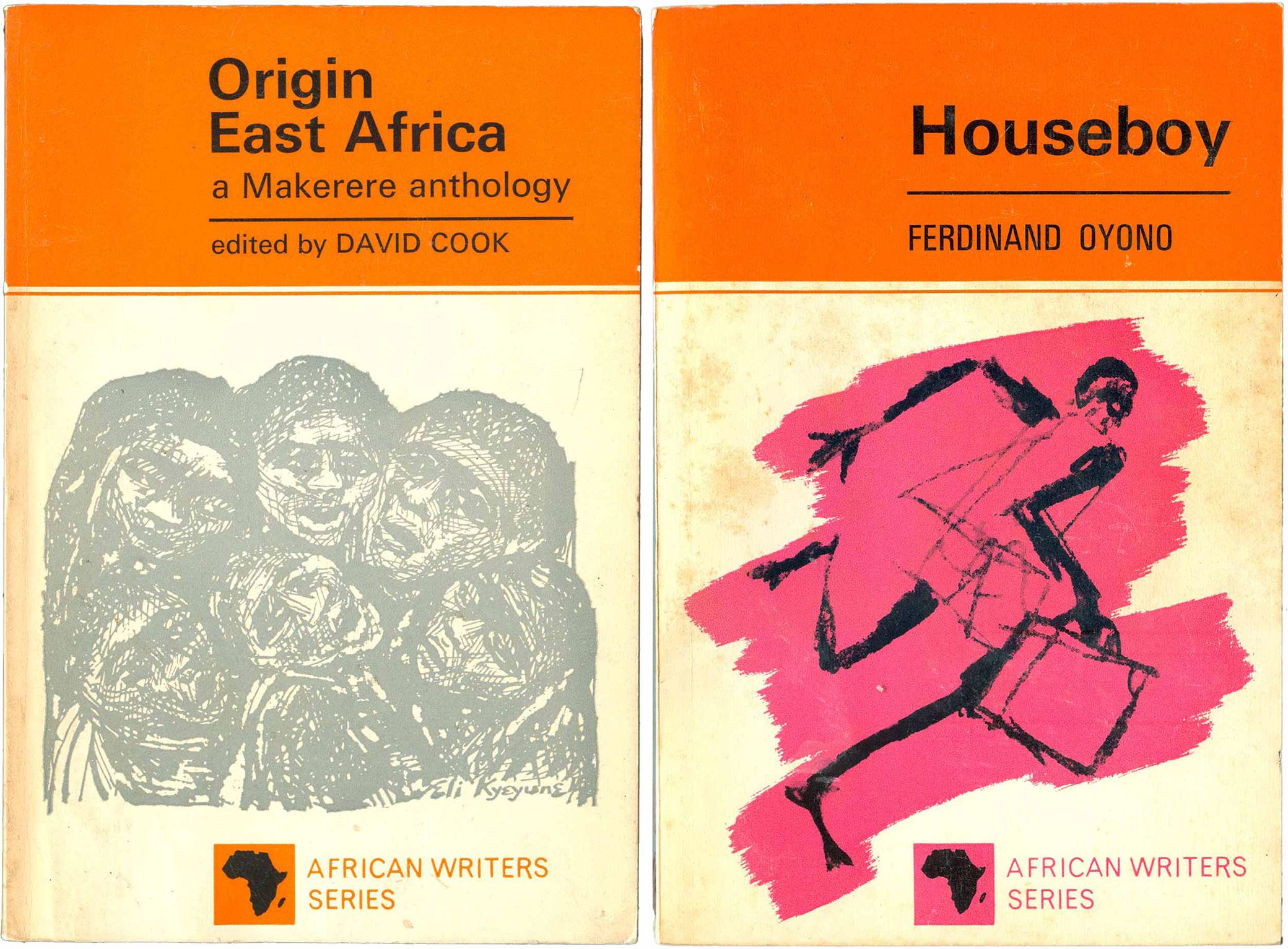
In 1965 the design was revamped, following in the footsteps of Penguin’s introduction of its new grid in the early 1960s. On the anthology Origin East Africa (AWS 15, 1965), the heavy black is almost entirely removed as a design element, and the top third of the cover is now a solid orange block, with a second hairline of orange running below it. This top area contains the title and author, which have now been reined in and rendered in a more traditional typeface (a variation of Penguin’s preferred Gill Sans). As on Penguins, the text is hard justified just left of the center line. The masthead has now become a logo of sorts, the Africa shape and series title floating in a small box at the bottom right of the covers. We also begin to see additional colors introduced, with a gray spot-color-printed illustration of a collection of singing faces. The spine has also settled into the design almost universally recognized by readers of African fiction: the top third an orange box containing the author’s name in black sans serif, the title running in black on white below, and the Heinemann Educational Books windmill colophon at the bottom, with the series number of the book sitting on top. Alex La Guma’s A Walk in the Night (AWS 35, 1968) is another successful design from this era of the series, the cover wrapped in a pop-looking illustration of a man in a stylish hat walking through the city. But a closer look reveals that the figure is closing his eyes in anguish, overwhelmed by the backdrop signs of commercial messaging and the rules and regulations of an oppressive government. This pulsing imagery mirrors the plight of the novella’s protagonist, a young “colored” man overwhelmed by unemployment and the ambient oppression of Cape Town’s District Six. With both of these examples, the design is less dense and constraining. The staid type gives the books an additional air of professionalism and uniformity, mimicking what had proved so successful with Penguin.
By the late 1960s, the designers begin to blur the lines between the titles and illustrations. Lenrie Peters’ book of poetry Satellites (AWS 37) is a good example. The initial 1967 printing has clear boundaries separating the title from the image. By 1971, with the third printing, the double line separating the title and illustration has been removed; more dramatically, the sun-like illustration has been enlarged and breaks the previously rigid cover grid, crossing the boundary into the top third with the title and Peters’ name. The image encircles the title, drawing attention to it, and these relatively minor changes make for a much more engaging cover.
. Cover on right from 1971.")
We also see the creation of the AWS colophon, a stacked A on top of a W, with the struts of the A crossing and extending to create an X. While Currey intended this pictograph to be an Africanized version of Heinemann’s windmill logo, it can also be read as an extremely simplified and generic African hut. For most of the series this colophon sat somewhere in the top right hand corner of the cover design, the space between the A and the W being a popular place for designers to drop the series number of each book. Along with the orange coloring, this logo has become internationally recognized as a shorthand symbol for African literature.
.")
This breakdown of the separation between cover elements is taken to a new level with Onuora Nzekwu’s Blade Among the Boys (AWS 91, 1972), featuring an astounding illustration by Peter Edwards. The image both embodies and resists the series design. Seeming doodles become snakes and circles, which resolve into a face that consumes the title and AWS logo. The face is marked with both tribal scarification and a rosary pouring out of the eye—references to the novel’s plot, which centers around one boy struggling between the draw of the Catholic priesthood and his tribe’s puberty ceremonies, which together consume him. The fonts, color, and composition have evolved since the early days of the AWS, but the logo still secures the top right corner of the cover.
AWS’ engagement with African illustrators is also worth noting. The cover of John Munonye’s Oil Man of Obange (AWS 94, 1971) initially appears quite traditional, a basic illustration by Uzo Egonu of a man and a woman. Yet the Léger-like weight of the figures gives them serious gravity, while the interplay of pattern and orange/black duotoning blurs foreground and background, keeping the eye engaged and interested in sorting out all the cover’s visual elements. A similar effect is found in Egonu’s illustration for the cover of Onitsha Market Literature (AWS 109, 1972). Here a small scene of a woman selling books and crafts is framed by a tent that evolves into patterned fabric, which in turn flows into the rollers of a giant printing press. It's the perfect cover for the book, a collection of popular short pamphlets in pidgin English produced and sold in Nigeria’s Onitsha Market. Egona was born in Onitsha in 1931; though he lived most of his life in London, he became known as a key promoter of Africa as a center of modernism.
.")
The overall cover design of the series took one of its largest leaps in 1971, when a photographer who had just fled apartheid and landed in London was fortuitously introduced to James Currey. George Hallett was assigned the cover for Dominic Mulaisho’s Tongue of the Dumb (AWS 98, 1971) on the spot, and produced the photograph on the cover overnight in order to prove himself. With its Rorschach montage of an African sculpture, it doesn’t seem like a dramatic alteration in the series design, but quickly Hallett would bring a sea change to the overall aesthetic of the AWS. Like early AWS author Alex La Guma, Hallett was originally from District Six in Cape Town, in exile from the apartheid regime. Under Currey, the AWS had become home to many authors and artists facing persecution in their native countries. Soon photography dominated the AWS covers in a wide range of uses, with Hallett and others moving from powerful arranged scenes (see the cover of D.M. Zwelonke’s Robben Island) and photomontage (Kofi Awoonor’s This Earth, My Brother...) to abstraction (A.W. Kayper-Mensah’s The Drummer in Our Time).
.")
In addition to his extensive cover design work, in 1979 and 1980 George Hallett photographed many of the authors of the series, snapshots used both as inset images on the back covers and as a standalone portfolio of photographs published by Heinemann. AWS regularly ran small author photos on back covers; unintentionally, these became a powerful statement in and of themselves. On the surface they seem innocuous, but quietly they began to redefine diversity on bookshelves across the English-speaking world. Each photo featured a unique and distinctive African, silently shifting the understanding of diversity from simple black/white to one recognizing all shades, sizes, and shapes of blackness.
This flexibility in series design was pushed to the forefront even more in the late 1980s, when structural adjustment and the rising cost of paper led to the collapse of much of the African publishing scene. HEB consolidated, relaunched the African Writers Series from London and New Hampshire, and gave it a new size, format, and design. These new AWS books were more traditional trade paperbacks and were firmly directed at a UK and U.S. market. George Hallett was dropped as the primary cover designer, and the work shifted to British design studios. Meanwhile local publishers in Nigeria, Kenya, Uganda, and southern Africa struggled to keep AWS titles in print. Cheap copies of popular titles began circulating across Africa, based on the original designs but so poorly printed and bound that they are almost impossible to read without them falling apart in your hands. At the same time, this unintentional (and likely pirated) democratization of the series has led to some books having upwards of a dozen cover design variations, all different yet recognizably connected to the original AWS.
.")
It is always difficult to assess the impact of publishing projects. What is the metric for success—sales, literary awards, references by successful authors? This is especially true of a project that is fundamentally distinct and idiosyncratic. The AWS has no real parallels within the Anglophone publishing world. There has never been as rigorous an effort to develop, illuminate, and distribute the writings of a body of immensely diverse writers sprawling across an entire continent. While the content of the series itself is often far from expressly political, the AWS embodies—in form—an internationalist politic embodied in the cultural output of the global South. This seems particularly potent in this historical moment, when a utopian, if flawed, Third Worldism has been replaced by a gloss of elite globalization over the extreme balkanization of the globe.